Categories
Design & technology

How to create good video content

Videos are an ever-present medium of communication that you can find anywhere today. From the smartphone to the big LED screen, visuals are some of the most attention-grabbing ways that you can get someone’s eye.

That’s why any marketing strategy worth their salt should integrate videos into their campaigns. Not because they’re ubiquitous – though that should be reason enough – but because video content can help you boost customer engagement.

These statistics show that even compared to other forms of marketing; video still has the edge:

  • 54% of users want to see more video content from brands they like
  • 88% of companies that use video marketing report high ROI and improved conversion rates
  • 88% of users stay longer on a website with video

And while videos are unlikely to fall from its place as an effective method of engagement, it’s not enough to attach some images or animate some slides. A poorly designed-video will have more or less the same effect as any other subpar marketing collateral, and might even cost you in the long run. Luckily, there are ways for you to avoid this pitfall.

But before we examine that, let’s talk about the one thing you should keep in mind whenever you want to create a video for customer engagement.

Purpose-driven video

The biggest mistake that you can make when producing video content is making it for the sake of making it. It’s easy to get blindsided by all the options you have when relating a video, and it’s these options that can muddle your vision of why you put out a video in the first place.

When you make a video, always keep the purpose of WHY you choose a video format to convey the message. While the statistics we showed earlier prove that video content has an edge with engagement, those don’t guarantee success.

Creating marketing videos is a great way to engage your audience / Source: Event Video Production QLD

Making video content for the sake of showing something rather than getting a message across isn’t just wasteful: it can backfire with terrible results. Consumers today are more aware of what content has substance in it and what content just looks pretty. And while you can pique their curiosity with a well-crafted video, it’s a purpose-driven one that can hold their attention.

So, whenever you discuss strategy around a video-centric engagement campaign, always keep the aim of why you made the video at the forefront of your mind. It’s easy to get blinded by shiny graphics and aesthetically pleasing models, but those things aren’t the heart of what drives video content and audience engagement.

But that being said, there are concrete steps that you can take to make sure that your message gets across – or at the very least, more straightforward to convey.

Ways to leverage video content for more customer engagement

1. Create compelling content

Everyone likes stories. And everyone has a story to tell.

Videos can get your story across, but you need to make sure that your audience has a reason to get invested in what you have to say. That’s where well-crafted narratives and compelling content fall under.

You don’t have to be an expert in filmmaking to do this: more often than not, building a sensible narrative is enough. Even a rudimentary grasp of how narrative writing works can be the difference between a flat narrative and a compelling one.

Make sure that your video makes sense in context. Have a beginning, a middle, and an end. Conduct market research to see which kind of storytelling will work with your target audience and the subject that you’re talking about. This step involves a lot of back and forth with your audience and video team, so make sure that the conversation is understood on both sides. Having these two work in sync is your best chance for creating a compelling narrative.

2. Show products instead of talking about them

Videos about products often fall into the trap of just talking about what the product does, instead of showing what it can do. And while you can wax poetry about how great your product is and how it works, nothing will beat a simple demonstration.

Remember, you have a visual medium to work with, which lends itself naturally to an actual demonstration rather than a written narrative about your product and service. People are more inclined to engage with something that they’ve seen working, rather than take its merits with no demonstration.

3. Entertain your audience

No one enjoys sitting through a dull video. That’s why it’s essential to keep your audience interested during your bit, and entertaining them is the best way to do that.

The simplest way to do this is through comedy, but it’s not the only way to do it. The best way to entertain your audience is to show actual interest and passion in your videos. People will subconsciously mimic the actions of others in a social situation, and a video can be the perfect bubble where you can take advantage of this inclination. You don’t have to be funny – you just have to be interesting AND be interested in what you’re doing.

Make sure that your entertainment matches the video that you’re producing. The last thing you want to do is to cause some dissonance between your message and how you deliver it. Not only will this confuse your viewers, but it also wrecks the entire point of your video.

4. Be genuine

For your audience to get a genuine emotional connection to a video, you need to be authentic. This is a tricky thing to convey in a video, but it is possible.

Being genuine refers to the capability of the audience to relate to your message, whether it’s a point you’re making or convincing them to see your side. The key to this step is to produce content that your audience will want to watch. Not only does this improve the conversion rate, but it helps forge an emotional connection between your brand and its audience.

Being genuine also means that you should always present your product or service as it is and never try to advertise or show more than what it can do. Be realistic in what you show since you don’t want to create any false or unreasonable expectations.

5. Post your video on multiple platforms

Whenever you release a video, always optimize it for multiple streaming sites. Even if you publish a video on one site, remember that people are browsing from multiple devices – which means different screen sizes and resolutions that different video streams can accommodate.

Get creative with your video content / Source: Media Chameleon

Remember that social media also has video streaming options, so check if your video can work on all formats. Not only does this give you more reach, but this is also the best way for them to show up on the site’s feeds or search options. SEO for small business will likewise benefit from this practice.

6. Always end with a call to action

A video isn’t complete without a call to action – whether it’s acting on the service provided or to buy the product. Since you’ve already gotten their attention by engaging them with the video, it’s easier for you to convince them to act on what you say.

The call to action doesn’t have to be all sales-centric and obvious: you can even consider the entire video as one elaborate call to action. The point of this method is to convince your audience to act on the message you present in your video. This can be as simple as asking a question or giving them a place to look for more information.

7. Make it shareable

Organic growth is one of the best ways to share any kind of content, and videos are no exception. If you structure your video campaign, so it’s easy to share, you engage with many market segments that you won’t be able to reach usually. Shareability improves the SEO for small businesses, aside from just putting your brand out there.

Allowing your video to be shareable also means your audience becomes ambassadors for you, driving even more engagement between those that may not be following your brand. Even just raising awareness through sharing your video can bring a lot of good traffic to your brand.

8. Give people a reason to buy

For advertising a product, you should be able to convince your audience to buy whatever it is you’re selling. Whether it’s by showing its good points, convincing them that this is something they need, or just proving it superior to other products, always go intending to make it desirable.

However, it’s important not to oversell what your product can do, or push too hard with making people buy. The best way to approach this is to give reasonable expectations about what the product can do and make these expectations desirable to the people watching the video.

Contact local videographers

9. Keep your audience in focus

Tone-deaf messaging is one of the worst things you can apply to video marketing – but it’s a common pitfall by a brand that doesn’t study its audience.

Before making the video, try to tailor it to what your audience would like to see. Since they’ll be the ones engaging with the content, making it more relatable to them can give it a higher chance of success. This doesn’t just go for content: it also means keeping things like web accessibility resources and other methods of access in mind.

Again, this is another aspect where knowing your audience is important. While you can make some general assumptions on what they would be like, direct contact with your audience is a better way to get a firm grasp of what they want to see. You can think of this as engagement before engagement – reinforcing the connection between you and your audience.

10. Thumbnails are important

Before your audience ever watches a video, there’s a moment where they can see the thumbnail.

This is more important than you think. A well-crafted thumbnail can stand out in the sea of other videos on a feed and gives your audience a reasonable expectation of what they’ll see when they click the video.

A thumbnail can also help with the video itself by either subverting or reinforcing the message of the video. In this way, it works as a compelling narrative storytelling tool.

11. Create interactive content

If you have the budget and the idea, you can’t try creating interactive videos. Plenty of video streaming websites offer some version of these videos, but if you’re hosting them on your website, you have more freedom in the content. If you ever build a business website, then this is a step you can’t miss.

Interactive videos offer an added layer of experience above the engagement that video already provides. By encouraging your audience to interact with your video, you guarantee their attention and engagement.

Just remember not to make the video any more complicated than it has to be. Simplicity drives effective interactive videos. If it’s too annoying or too complicated, your audience will lose interest and will drop engagement.

12. Feature your audience in video content

Finally, featuring your audience in the video can be a great way to make engaging content. This can be as simple as featuring regular customers, to featuring content created by your audience.

User-generated content doesn’t just connect better with your audience, but you also save on the actual costs of producing the content for the video. User-generated content needs minimal editing and retouching so that you can pour your resources into other parts of the video.

One thing you should avoid is to mess with the content used in the video. The advantage of using user-generated content is that there’s a greater chance it can engage your audience since it’s more authentic and close to their experiences.

Video as a connection

Making video content is a necessity that any brand strategy needs to take into consideration. But a good video doesn’t always cause a successful one, and neither do successful videos always come from good looking video.

Video content should accomplish one thing above all else: be something that leaves an impression on the people watching it. With a good grasp of what to show and whom you’re showing it to, making engaging videos can be a reliable and successful endeavour.

Categories
Design & technology

The do’s and don’ts of managing your online reputation

Having a positive reputation online can often mean the difference between winning the job, or losing the customer. Think about your own browsing habits when deciding on buying a product or requesting a service. How often is your decision swayed by the number of stars on an item listing? Do you look at how the product performs in the real world, beyond the advertised? 88 per cent of customers say that they determine the quality of a local business based on their reviews.

Here are the best practices of online reputation management and exactly how you can make your review forums work in your favour. 

The wider your coverage, the stronger your credibility

Firstly, ensure you’re set up on a number of trustworthy review platforms and forums such as:

A good starting point is to check out where your competitors are, chances are you should probably be there too.

Eliminate the barriers

Make it as easy as possible for customers to review your work online. One of the simplest ways to do this is to send clients a direct link to your business’ review page/s via email, SMS or even at the top of your invoice. The review process should be quick and streamlined, not long and tedious. Top-performing Oneflare businesses also suggest a follow-up call to ensure the client was happy with your work might be a good option and, if they are indeed pleased with your performance, it’s the perfect time to ask for a recommendation.

Determine the right timing of the invitation

Ideally, you should engage with your customer and ask them to leave you a review when they’re at their happiest. For example, if you’re a wedding photographer, it might be helpful to ask for a review when you deliver the photos of the big day. Nothing wrong with taking advantage of peak customer satisfaction! If, however, you’re a builder and you’ve been delayed on finishing a project, you may be better off holding off asking until the service is complete.

Make it as easy as possible for customers to leave reviews / Source: Shutterstock

Incentivise

While you are not legally allowed to buy or pay for a review, you can gamify the process by:

  • Placing any one who leaves an honest review (good or bad) in the draw to win something; or
  • Organising a ‘surprise and delight’ for one lucky customer who has left an honest review. 

Find opportunities

If someone sends you a review via email, text message or over the phone, feel free to either send them the direct link to your preferred review platform or ask them if they’d be happy for you to copy and paste/type out the review on their behalf. Alternatively, you can post it as anonymous. 

Include the good, the bad and the brutally honest

A page full of glowing reviews is usually a red flag for prospective customers (fake alert!). Each comment is a useful insight into how your business is performing, so always listen and aim to do better! It is, after all, a valuable learning experience. The aim is to collect as many positive reviews as you can and turn each negative experience into a positive one.

Never reply to a negative review when you’re frustrated

Just like the old adage of never going to bed angry, resist the urge to bite back when you’re upset. Take a breath and take the time to process the comment before responding, you might find you’ll learn some valuable feedback. If you’re certain you’re not in the wrong, make sure to describe what you did to resolve the situation before the review was posted publicly. 

Contact local web design experts

Resist the urge to say, ‘I’m sorry you had a bad experience

Instead, kill ‘em with kindness. Empathise and get on the front foot by showing prospective customers that you are a professional business willing to fix genuine mistakes and rectify the situation if required. Promptly offering an appropriate solution to their problem will likely eventuate in a return customer.

Avoid using emotion or sarcasm

Sarcasm and tone don’t necessarily translate well online. As an attentive service provider, you’ll need to give the customer the benefit of the doubt, while remaining rational, cool and factual at all times. 

Act fast

A negative review is a ticking time bomb, so ensure you address the complaint respectfully and appropriately in a timely manner. Leaving the review unanswered can turn away potential clients so make sure to prioritise a response. Interested in learning more? Our Oneflare HQ industry leaders in sales, marketing and SEO can tell you all about new technology and how to build trust with potential customers online. Check out the video here.

Categories
Design & technology

The best apps for small businesses

Running a small business often means doing several jobs at once.

As the business owner, you are simultaneously the employer, employee, accountant and admin as well as anything else that pops up during the course of a job.

If you feel like your time is constantly being pulled in multiple directions, and it is hard to stay on top of your tasks, don’t worry, we have a curated series of apps to help get your time back under control.

General productivity

Google Keep – iOS/Google Play

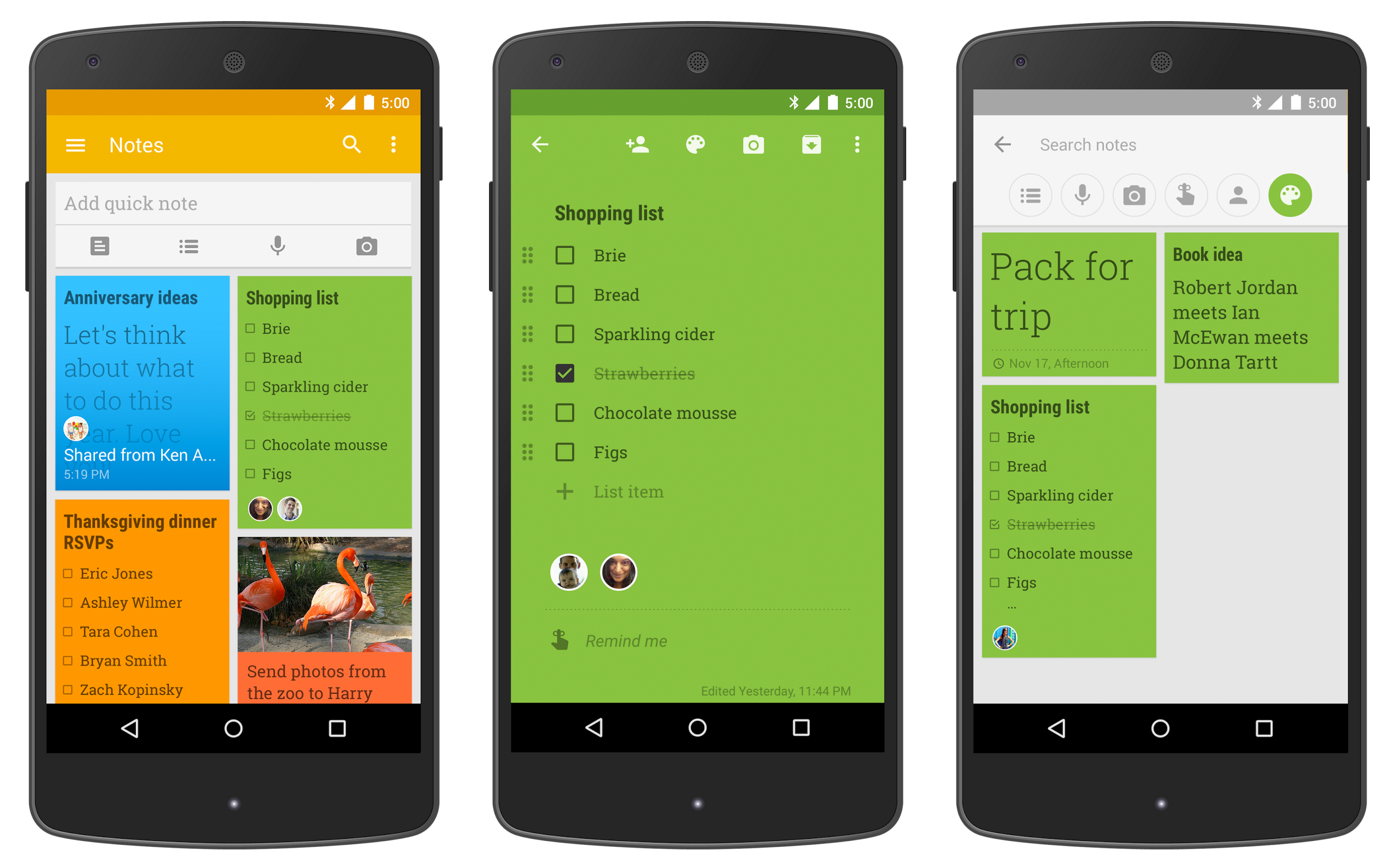
If you find that you are always misplacing notes, then Google Keep is for you. Keep’s strength comes from its simple design and tagging system. Quickly jot down a note and then either colour code it to the job it is related to or add a label for easy searching at a later date.

Keep also has a handwriting to text feature. Which, while admittedly not perfect, is an excellent way to save your pen and paper notes to the cloud!

You can also add photos, audio files and video to your notes as well, ensuring you have all of your information readily accessible no matter where you are.

Time management

Toggl – iOS/Google Play

With the press of a button, Toggl will track your time down to the second. This app is useful if you have billable hours that you need to account for, as well as getting a measure of how your time is spent. You can track different activities, and, importantly multiple employees which you can then break down into smaller groups as needed.

Ensuring that you are making the most of the time you have on a project is an excellent way to minimise stress and manage your workload.

Toggl is free for up to five users. The paid version, however, allows an unlimited number of users to log time as well adding rates and sub-projects.

Project management

Trello – iOS/Google Play

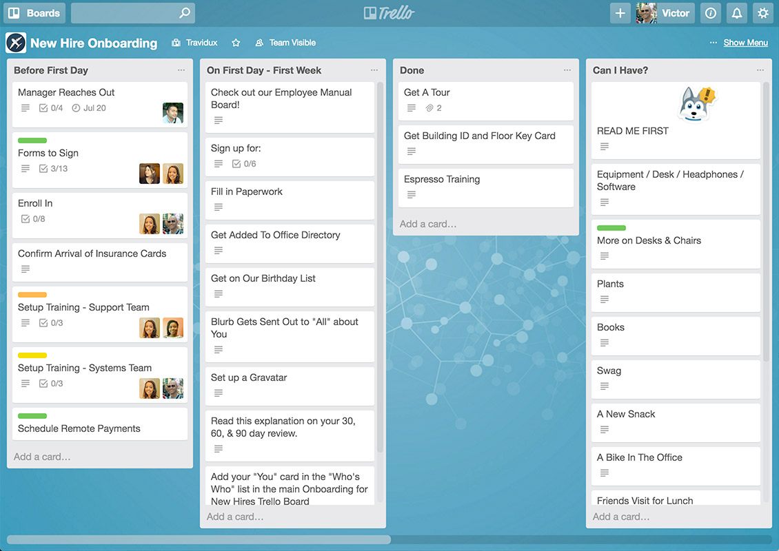
If you work in a highly visual manner, then Trello is the to-do app for you! Trello is a digital version of the Kanban system. You create a board with a series of cards to move across the different stages of a project. From quoting, to in progress, to complete. You can also assign cards to employees ensuring that everyone knows what part his or her role is in the project and who has dependencies at the different stages.

Having an overview of the project’s progress will give you a much clearer idea of the remaining time and costs involved and ultimately keep you and your staff on task.

Trello is free for personal use but does incur a fee if you are signing up multiple people under the one business.

Accounting

Invoice2go – iOS/Google Play

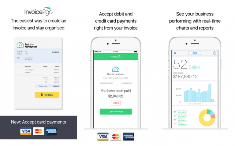
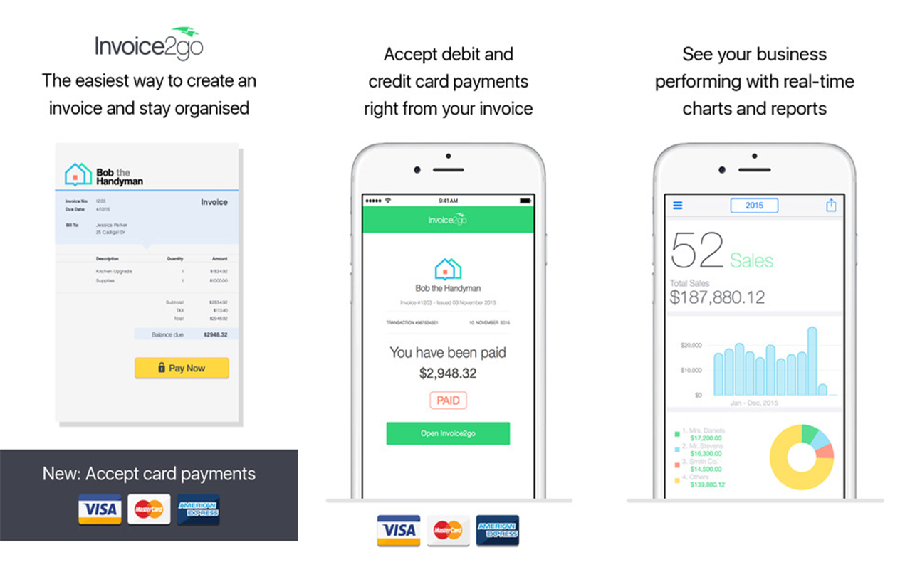
Invoice2go makes your accounting simple. With a few swipes you can invoice a client on the spot. Either by emailing them or exporting a PDF and printing.

It also keeps all of your accounts in the cloud, meaning wherever you are you can access your invoices, estimates and purchase orders from your office.

Users, reportedly, spend an average of three hours a week less on their accounting, meaning that you can devote more time doing what you do best – helping the customer!

If you are feeling overwhelmed at the thought of all you have to do, being able to keep all your notes in the one place, track your time, plan and manage projects and invoice on the go by downloading a few apps to help streamline your business will ultimately save you both time and money.

Categories
Design & technology

Best free apps for small business owners

Growing a small business 20 years ago compared to now has changed significantly, thanks to always-evolving technology, increased competition in the economy and a faster-paced way of living. Nowadays, business owners have turned to apps, to help with the way they organise to-do lists, invoices and everything in between; saving time and money. In no particular order, here are six free apps that will change the way you conduct your business:  

1. Boomerang

Available on Google Chrome web browser, Google Play

applications for business

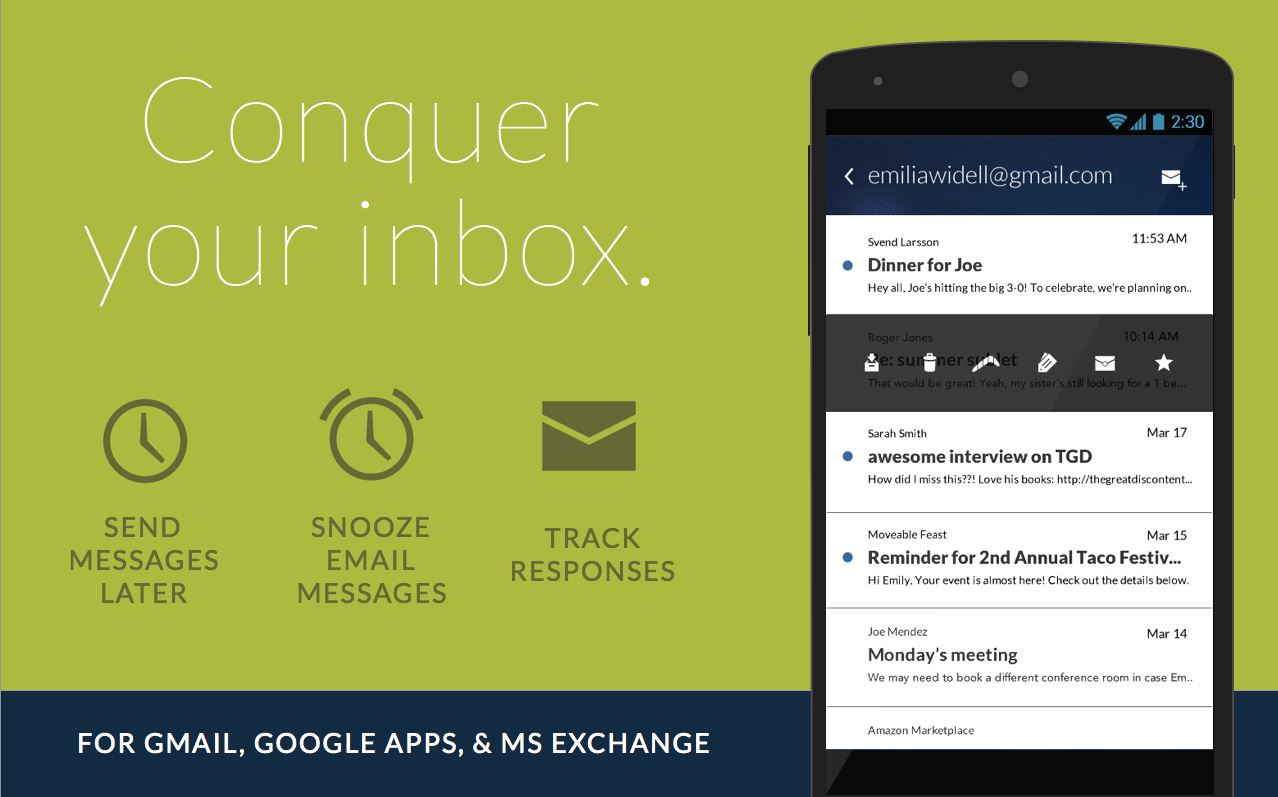
Boomerang, an application that acts as an add-on for Gmail, assists you with the organisation of personal as well as business-orientated emails.

From letting you set a notification pop-up if you haven’t received a reply on an email within a specified amount of time, to letting you ‘boomerang’ messages back to the top of your inbox at the time when you actually need to pay attention to it. But the main feature that makes this app a winner is how you’ll be able to schedule emails to send later on. This feature allows for you to write all your emails on weekends or late at night, and schedule to send it at a more appropriate time.

2. Oneflare for Business

Available on iTunesGoogle Play

Gaining exposure to new customers is always at the forefront of any growing and evolving small business. The Oneflare for Business app connects you with customers looking for your expertise; whether that’s pet grooming, plumbing, interior design or everything in between. The app which helps you find work when you want it, utilises a clean, simple layout that suits even the least tech-savvy user. Get notified instantly of available work within your area and respond with a detailed quote and even communicate with potential customers within the application itself. With more than 10,000 new jobs posted on Oneflare each week, it’s the smartest way to connect with customers and build your business even further.

3. Mint

Available on iTunesGoogle Play

phone apps for business small businesses

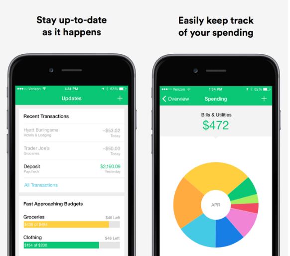
Mint is your go-to app for managing finances and potentially saving your business some dollars. Whether it be personal or business finances, the app allows you to securely consolidate your accounts, track how much you’re spending, and receive alerts when bills are due. Set reminders and finance goals, tag expenditures by category, and view your financial data as simple charts or Excel spreadsheets in a way that’s easy to digest.

4. Evernote

Available on iTunesGoogle Play

evernote app easy business

Evernote is a one-stop shop for all your personal and professional projects – take notes, create to-do lists, save voice memos, save photos, scan documents and even save sketches – and share it all with coworkers. Best of all, the app synchronises everything between your phone, tablet and computer automatically. Easy!

5. Invoice2Go

Available on iTunesGoogle Play

invoice2go apps make life easier

This cloud-based app makes invoicing and quoting a breeze for your small business. Invoice2Go is the ideal invoicing solution for all types of businesses. You can even invoice on the spot: right when you finish a job, email or print your PDF invoice by a click of a button right from the app.

6. Weebly

Available on iTunesGoogle Play

weebly

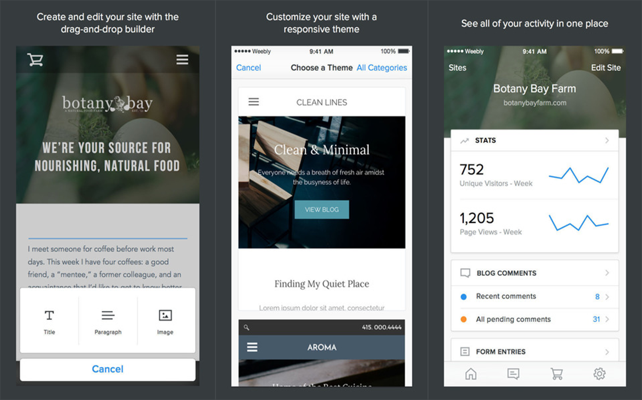
It’s the 21st century and your small business basically doesn’t exist without some form of online presence. Weebly makes website creation easy for the less creative-minded, you certainly don’t have to be a web-designer professional to use it! Simply drag and drop images, logos and maps into a chosen template, and add text wherever you wish. Publish your new website quickly and easily right from your tablet.

No one ever said starting your own business was going to be easy. However hard work and dedication can be made easier thanks to the help of a few useful apps.

Categories
Design & technology

Top 5 website design mistakes

The internet provides unlimited access to knowledge which means that just about anyone can teach themselves how to do web design. Unfortunately, this can have a negative impact on the effectiveness of the DIY website they create as a result. Here are several common web design mistakes small businesses make that must not be overlooked.

1. Cramming too much on the homepage

While you may be in a rush to present your audience with all you stand for and show them everything you have to offer, trying to cram too much on the homepage usually isn’t a great idea. There are two major reasons behind this. First, it will make your navigation counter-intuitive, seeing as your audience won’t know where to click. This results in bad user experience. 

Secondly, every single element you include requires an additional HTTP request. This can slow down your website significantly. Due to the fact that your audience expects a website to load within the first 2 seconds (on average), this might become a significant problem. If your website fails to load within the first 4 seconds, as much as 25 percent of your audience may move on. It’s also a negative signal for search engines.

2. Failing to introduce yourself

One of the greatest mistakes you can possibly make in your web design is assuming that the visitor will know what you are all about the moment they click on the link. Sure, some of your audience members are more intuitive than others, while a great deal of them knew who you were even before they clicked the link, however, this should not be your initial assumption. Your design and your content must first be oriented towards the introduction.

Web designers can optimise your website for all types of devices / Source: Webilicious Web Design

3. Rushing with your CTA button

Every website out there has an agenda. You may want your visitors to buy a product, leave an email, subscribe to your newsletter or simply encourage them to learn more about the topic at hand. Unfortunately, pushing them to make this decision before they are ready to do so may backfire. In order to avoid this, make sure to introduce yourself and show them what you have to offer, before presenting them with your call-to-action (CTA) button.

4. Failing the consistency test

These days, more people are browsing the internet through their smartphones than through their desktop setups. On the other hand, more people use PCs than tablets, which puts you in a complicated situation design-wise. Sure, appealing to one audience may seem a preferable choice but you simply cannot allow yourself to ignore all the rest. Your website needs to show consistency in both visuals and functionality across all devices and failure to do so will impact negatively on user experience.

Contact local web designers

5. Ignoring white space

Earlier on, we talked about cramming too much content from the perspective of the website loading time. In addition to this, ignoring the white space and inserting too many interactive elements into your design reduces the readability of your content. Separating paragraphs within your content and leaving enough space between different elements of your webpage is something that will make it more visually appealing. In this way, you are increasing the chance that people (especially those on mobile devices) will actually skim through or read your content. In a world where 8 out of 10 people don’t read past the headline, this is very important.

By acknowledging these important failures of web design, you are ensuring that your website will make a great first impression on your audience. In this way, you are also increasing its reach and its average conversion rate. Finally, while the above-listed principles are quite intuitive, a lot of DIY designers tend to ignore them. Nonetheless, keeping them in mind at all times can ensure your web design is always on point.

Categories
Design & technology

How to plan your web design

There is seemingly no end to web design businesses in the market. They price themselves from as low as $199, and all the way up to $25,000. Sometimes there is little difference between what you get as an end result.

After 10+ years running my web design business I have learnt that there is a way of doing things which will ensure the highest chance of success for your website build.

The biggest mistake people make when buying a website is looking for web design right off the bat. Then a web designer will ask them to pull together their content, some images and make them a website without really knowing their business or their clients.

Planning your website build will help save time and money in the long run / Source: MG Datacomm

There are 5 clear steps to building a quality website, if followed step by step you should end up with an awesome website and great results.  These are website planning, content creation, web design, web development and hosting.  In this article we will focus on planning your website and follow up with a little more about the other areas.

Web design planning

When you open a new business you would rarely do so without a business plan. Any real investor will not release funding until they have seen a strong business plan. This should be the case for your website as well. Why would you invest time, energy and money into building a website without planning its future and how it will benefit your business?

When you plan your website in advance you get to choose who it will appeal to and therefore the calibre of your future sales leads.  You also get the chance to plan your search engine ranking, content direction, the user experience and the way they think about your industry – their worldview.

Search engine ranking

I have rarely met a business owner who doesn’t want to ensure their website is benefiting from regular search engine traffic. Some people even pay Google thousands per month for this honour. By researching your keywords and planning each page to be compatible with those search terms you will give yourself the best chance of that happening. Planning the next 12 months of your blogging efforts is also wise, ensure you base each blog article on a search term which you want to be seen on as well.

Content direction

Your written content is of huge importance, people actually will read your website. If it’s boring or not what they were looking for, you will lose them in the first 10 seconds.

When writing your content you need guidelines planned. The guidelines should give an idea of the goal of your article, how it will help your reader and what you want the reader to do after reading it. If you have someone write your content for you professionally, that person should be able to ensure they shape the content in a way that compels your reader to want to spend money with your business. That’s called ‘converting content’.

User experience

When planning your website it’s important to think about what the visitor will experience on your site, how the site will encourage them to move between pages and the overall subconscious emotional response you want to trigger. Ensure that you plan the site so there is not too many clicks between landing on the site and converting as a customer. The more clicking a visitor has to do the more likely they are to get annoyed and look elsewhere for their information. Likewise on forms, the more fields a user must fill in – the more chance there is of abandonment.

Website images

In the planning of your website you need to ensure you select the images which will be used in the web design phase. Ensure they are high quality and represent your business well. Ensure you choose images with people who are similar demographic to your potential clients. Don’t forget to use images with people smiling! You can also get some wonderful images from Stock Photo sites. These can really make a difference and save you a fortune on photography.

Check out sites like Pexels, iStock, Shutterstock and Adobe Stock. They are often a real help to Web Design.

Website framework

The most common web design framework in the industry today is WordPress. Once you get used to it you will find it is not too hard to use and has a lot of added bonus features which can be installed as plugins from within the CMS.

When selecting a WordPress theme, make sure you don’t just buy the first theme you find.  Many of the cheap themes are sourced from hobby web developers who want to make extra money while they study. They may look great but they often let you down in the code department. This leaves you open to future malfunction not to mention security holes allowing some hackers to penetrate your website. I like to stick with premium theme clubs for my web design. I use Yootheme for many of my projects due to their clean code and great layouts. Yootheme does have the ability to build your site with a site builder, however I avoid complications by just using Widgetkit and raw wordpress.

Contact local web designers

Planned web design

There have been many sites I have planned or re-planned in the past. Here are a few of those which were planned for success and succeeded as a result.

I have a client who owns a web hosting company which specialises in looking after businesses who have large server needs. His business Website is Amaze.com.au.  I was commissioned to re-plan their website. It was built by a large agency who had done nothing about planning the SEO or implementing onsite SEO. 

I planned the site over the course of 1 month. I created a development version of the website to work on so as not to cause any issues with the live site. The plan was then implemented onto the website page by page until I was finished. Once the site was put live, it saw great results within just a few days of launching!

One of my longest held clients is Occupational Safety Solutions, who sells SWMS Templates through their online store. We planned the search engine success for this site as well as the visual user experience. This client had huge benefits from our web design planning and went on to grow their business. 

Wrap up

I sincerely hope this article helps you realise the benefits in web design planning and what it will do for your future web design project. If you have any questions feel free to contact myself or one of my team for some great answers!